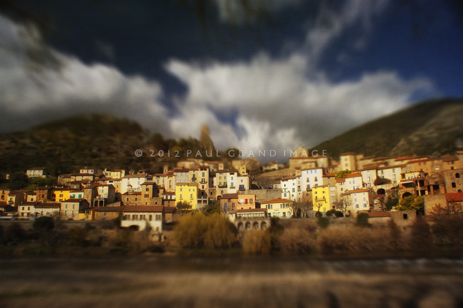
Having finally upgraded my 2008 Imac’s system so that I could try the new Photoshop CS6 and use its new filters, I have to say all the expense and disruption was worth it! The image above was taken a couple of years ago in early spring with my old Sony Alpha 5, just before I moved up to the full chip 5D Canon. This picturesque village of Roquebrun, famous for its early blossoming Mimosa trees, has its own microclimat, being south facing and out of our freezing northerly winds.
The picture was ok, but i’d never published it because it lacked something, it was somehow slightly disappointing with those over-busy clouds!
I came across it from one of my several external HDD, and thought, yep, this one is perfect for the new CS6 Tilt Shift filter!
Firstly I watched a couple of You Tube Tilt Shift CS6 tutorials, there are several, but I found this one the most inspiring so far:
When I used this Tilt Shift filter on the above, I wasn’t quite happy with the effect, so I ran it through again, yes, Twice! And then I was finally happy with those overbearing clouds. At this point it had much more depth but I still found it too cold, so I opened it up in Nik Colour Pro and warmed the tones, making those yellow houses really zing out!
If you look closely you’ll see I also removed some restaurant signage from buildings frontages, to get it ready to sell, this is now automatic to me,
and saves lots of later wailing and gnashing of teeth when you get those annoying little Editor notes from Getty telling me you ‘remove all text before uploading’!
After the Nik warming I saved and opened our Russell Brown Flypaper panel and had a play with the Flypaper Taster pack,
I ended up using just two, but they added such a richness and an organic filmic grain that it really brought the image to life.
The first texture was Muscatel, with a soft light effect at 82%, I then took a soft brush and removed a letter box section from the crisply focused middle buildings, to stop them getting too muddy. This also helped the vignetting effect add more depth. Then I used Touchstone, but decided to keep it subtle and took it back to only 16%, this left a nice soft grainy effect, not unlike old fashioned film grain on the blurred clouds. I had tried painterly brush strokes but decided this image should look more like a real photograph!
Muscatel, Soft Light effect at 82%, softly brushed away from focussed central buildings only,
but leaving the edges, a kind of thin letterbox shape
Touchstone – Soft Light @ 16%
For cards and prints please visit my brand new outlet! Fine Art America
Please visit our Pack page or Combo Pack page to buy Flypaper Textures.