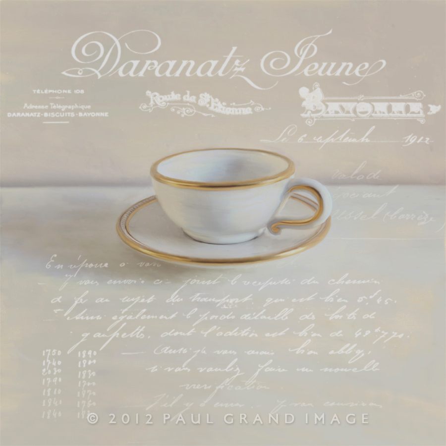
Welcome to our new season of overlays, we’ve been planning this for several months and is only now possible to sell more products with our pro website and Jason – our web masters kind hosting!
As I’m based in France we have access to all kinds of French Vintage stock, the first were the Vintage Glass Edges set, this is the second and we’ll be releasing a third very shortly.
With these overlays we wanted to show how its easy it is to add another layer of interest and using our ready processed png format allows you to simply place the overlay on top of your base image and then remove the parts that you don’t need. There are no formal rules for using these vintage overlays, different people will use them entirely differently, for instance, I like to use them in a bold graphical way, and Jill seems to prefer to use them almost like textures with a soft washed out effect. This is great because we can show the versatility of these overlays and cover much more ground.
When I choose an overlay, I naturally tend to try to find text that relates, we’ve tried to translate the basic subject in the headers, though sometimes the text is totally random like an Epicirie selling a car part!
For this coffee cup I’d previously made painterly by using Russell Brown’s new Oil Paint script, I chose a biscuit receipt, and thought it would add much more to the story than a simple cup on its own, indeed when I now look at the original image I see it as being somehow ‘nude’! We’ve seen several fans use these overlays and are delighted with their results. One thing we might suggest, is to try and tie the overlay in with the image more, by not just using a header at the top of the image, which works to re-balance, but doesn’t relate to the main body of the image, thus not quite pulling the whole image together. But this is just my personal thought and doesn’t in anyway detract for the excellent images we’ve seen already!
Another tip I’d like to share is to soften the overlay slightly, by around 1% in Gaussian Blur, this helps soften the edges, which can look awful when uploaded to Flickr with its over-sharpening effect.
For the above image I changed the overlay colour to an off white by:
Simple colour change instructions:
Once you’ve moved the PNG overlay onto your base image in Photoshop: Image – Adjustments – Hue / Saturation. Move sliders to approx. 30% for Saturation and Lightness, & move top slider to colour. For full white simply move the bottom lightness slider all the way to the right.
When using the overlay Jpeg version I would suggest using Multiply if you’d like to get the most transparent filter effect.
Recipe:
Base image doubled – Multiply @ 27%
Biscuits – Bayonne – Soft Light @ 100%
Biscuits – Bayonne – Normal @ 100%
I darkened the base image by doubling up in order to give more contrast to the overlay text.
And softly removed the text from the cup area.
Please note although we’ve taken great care to check that these companies are no longer existing, care should be taken when publishing in the press just in case any relatives are offended by any inappropriate montages! 🙂 For your own art there is no problem incorporating publicity, think Andy Warhol and his soup cans! 😀
Go to our Pack page or combo pack page to buy Flypaper Textures.
French Receipt PNG Overlays
44 French Receipts PNGs
$40
French Receipt JPG Pack
44 French Receipts JPGS
